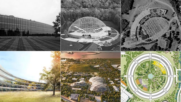
Online, Apple, Facebook, and Google are competing to control the future of technology. Offline, they are competing to build the future of corporate architecture—small cities nestled in the Silicon Valley suburbs that are designed by some of the most famous architects alive today. It’s a space race. Literally.
These buildings are powerful marketing tools. They’re designed to reflect what makes each tech giant unique, and to reflect the work and mission of each. They’re more like branding than architecture—sprawling, glassy developments designed by carefully selected architects that seem closest aligned to each respective company’s identity. Apple has the elegant, stoic Sir Norman Foster. Google has the fun-loving it-boys Bjarke Ingels and Thomas Heatherwick. Facebook? Facebook has the cranky expressionist Frank Gehry.
But there’s no such thing as tabula rasa in architecture. Designers learn from their elders, and a bit like your smartphone, every building has a predecessor—including these ones. That’s not to say that these buildings aren’t original (they are). It’s that they’re drawing on an amazing, half-forgotten history of corporate office design that was spurred by IBM, Bell Labs, RAND Corporation, and many others—decades before the iPhone was a twinkle in Apple’s eye.
Apple’s Spaceship
When the British architect Norman Foster unveiled his vast, circular office design for Apple, there was a single word that kept coming up as the world worked to describe it: “spaceship.”
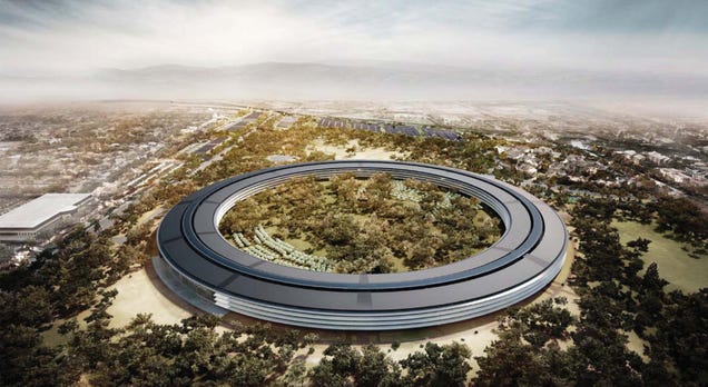
They weren’t wrong. This thin, glass-wrapped corridor, which curls into an infinite loop like a snake eating its own tail, feels like an extraterrestrial world. It’s isolated from the neighborhood around it by acres of trees and green space, as self-sufficient like a spacecraft would be. It’s oriented inward, towards its own lush garden full of apple orchards and olive trees. The New Yorker calls it “a private walled garden, costing an estimated five billion dollars.” It even has its own recycled water system.
It’s tempting to see the building like the iPod or iPhone: An object totally free of history and precedent that just fell out of the sky one day. In reality, Foster’s building on the ideas of a Finnish-American architect named Eero Saarinen, who in the 1960s and 70s designed some of the earliest and most important corporate campuses on the planet for clients like IBM and Bell Labs.
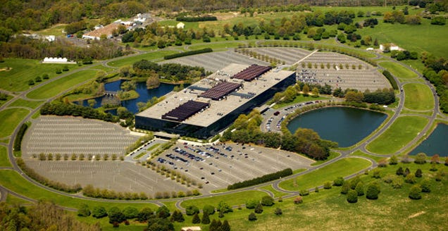
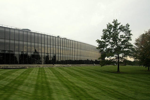
Bell Labs by MBisanz.
If you haven’t heard of these buildings, you’re not alone. They’re nestled in lesser-known suburbs of New York and New Jersey, where half a century ago, companies were developing the technology that made cellphones and laptops possible. For example in Holmdel, New Jersey, Saarinen designed an office for Bell’s R&D wing that became known as “the birthplace of the cellphone,” seen above.
In Yorktown, about 40 miles north of New York City, IBM hired Saarinen to build a lab that would express its extraordinary technology through architecture. And what he made tells us a lot about what Apple is going for with its new campus.
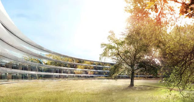
1961: Watson Research Center by Eero Saarinen. Image: Archman8. 2016: Apple HQ by Norman Foster.
In 1961, IBM commissioned Saarinen to build its Thomas J. Watson Research Center: A secure, relatively inaccessible place where the company could houses its research wing—which at that time was working on everything from supercomputers to theoretical physics.
The building Saarinen designed was “part university, part monastery, and part fortress,” as John Harwood writes in The Interface: IBM and the Transformation of Corporate Design. Its entire facade was curved, wrapping around an incomplete circle that was oriented towards the forest around its concave side.
Like Apple’s new office, which is almost hidden inside acres of trees and gardens, it was intentionally difficult to access. It “greets the arriving scientist with a nearly blank wall,” Harwood says. “Entrance is only possible by crossing over a ‘moat’—a sunken landscaped garden of crushed white limestone and grass mounds.”
The circular facade wasn’t just for show. It was a design feature intended spur collaboration between the scientists inside by giving them easy access to each others’ offices and labs. “The large curving hallway running along the building serves as a promenade in which IBM scientists and engineers converse and hold discussions at specifically designed alcoves that face out to the forest that lies beyond,” as the American Physical Society Sites puts it.
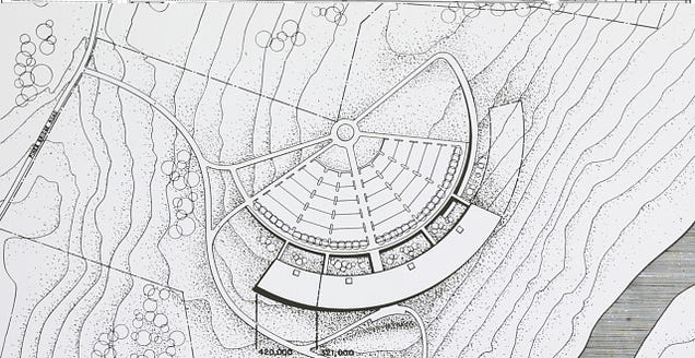
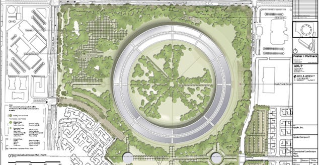
1961: IBM by the Library of Congress; 2016: Apple.
Foster and Apple explain the circular plan of their office the same way. “The concept of the building is collaboration and fluidity,” Apple’s CFO told Mercury News. “It’ll provide a very open-spaced system, so that at one point in the day you may be in offices on one side of the circle and find yourself on the other side later that day.’’
This isn’t actually the first time Foster has appropriated Saarinen’s circle language. “At that time, this was an extraordinary composition!,” writes Hardo Braun in Research And Technology Buildings. “Just how groundbreaking the scheme really was became apparent 40 years later when Sir Norman Foster adapted it for his McLaren Technology Center.” And now, in Cupertino, he’s finally completing the circle.
Google’s Canopies
So what about Google, the most recent to unveil is plans for a new campus?
Google actually chose two younger architects to collaborate on its plan: The Danish-born Bjarke Ingels, and the British designer Thomas Heatherwick. Together, they designed a series of lightweight, tensile structures that will blanket dozens of new offices which themselves can be moved and added to as time goes by.
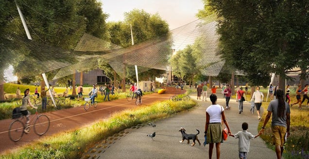
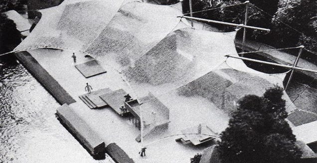
Google’s new campus; Frei Otto model via Icon Eye.
Because we know less about the specifics of the design, it’s harder to compare it to one specific building or architect. The tensile canopies hearken back to the German architect Frei Otto, who in the 1970s pioneered the idea of cheap, lightweight structures that acted like giant tents to enclose outdoor spaces for human use.
Or you could look at an office on a rural patch of land just south of Lake Erie in Geauga County, Ohio, where in 1959 the American Society for Metals—or ASM International—built its world headquarters. In the 1950s, it decided to build itself a headquarters on a patch of land in Ohio, where an architect named John Terrence Kelly was recruited to build the office.
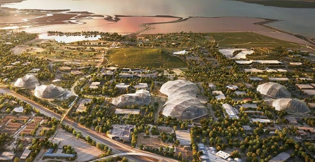
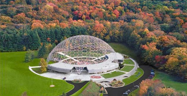
Google campus; AMS Headquarters via Wikimedia.
Like Ingels and Heatherwick, Kelly designed an elegant and simple building, but that was hardly the point—he also designed a huge geodesic dome to cap the structure, whose tens of thousands of distinct pieces create a half-indoor, half-outdoor space.
The dome itself is often credited to Buckminster Fuller, but it was really built by Synergetics, Inc, the engineering company that specialized in building the domes Fuller designed. It’s a similar idea to that of Google’s architects, who say in a release that “instead of constructing immoveable concrete buildings,” they’re creating “lightweight block-like structures which can be moved around easily as we invest in new product areas.”
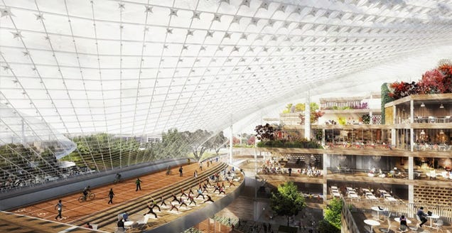
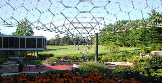
Google HQ; AMS headquarters by Flickr user Jason/CC.
At AMS’ headquarters, engineers could debate and discuss the questions of their day in nature, around a “mineral garden” displaying all manner of metals and ore, protected by Fuller’s dome.
Google employees will have similar opportunities to commune with nature: “Large translucent canopies will cover each site, controlling the climate inside yet letting in light and air,” the company writes. “With trees, landscaping, cafes, and bike paths weaving through these structures, we aim to blur the distinction between our buildings and nature.”
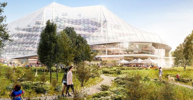
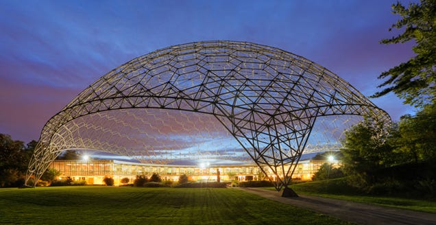
Google; AMS headquarters by the Chesler Group, which renovated the structure.
Facebook’s Shed
On Monday Facebook unveiled its new Menlo Park office, designed by Frank Gehry of ”Architecture Is Shit” fame. Mark Zuckerberg calls the new space “the largest open plan office in the world.” It’s basically a half-mile-long shed, where Facebook’s teams work in the same room, topped by a roof deck.
Gehry himself insisted that it’s “not a grand design statement.” Zuck, he said, “wanted a space that was unassuming, matter-of-fact and cost effective. He did not want it overly designed .” The idea is to distance Facebook from the wildly expensive and precious architecture of its competitors—this is an office, not art, you guys.
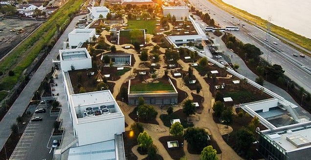
Facebook’s new office by christauziet.
If it seems like Gehry and Zuckerberg are harping pretty hard on the “under-designed” thing, it’s because they are. They’re drawing on an idea that’s been kicking around since World War II. The theory is this: That the best work happens when you throw a bunch of people in a random box that means they have to interact and engage with each other to work.
You can find the same idea all over the place. Look all the way back to the RAND Corporation, which grew out of several World War II defense departments to lead the information revolution in the 1950s. RAND designed its own simple headquarters in Santa Monica based on the same theory.
The critic and architect Michael Kubo wrote a thesis and book about the building called Constructing The Cold War Environment: The Strategic Architecture of RAND. The book’s description says, by way of introduction, that the building was “designed (based on a memorandum written by a RAND mathematician) as a redundant matrix of corridors to maximize chance interactions among researchers and promote creative thinking.” Essentially, it’s randomness generated by math—engineered to engage human inhabitants, just like Facebook’s new office.
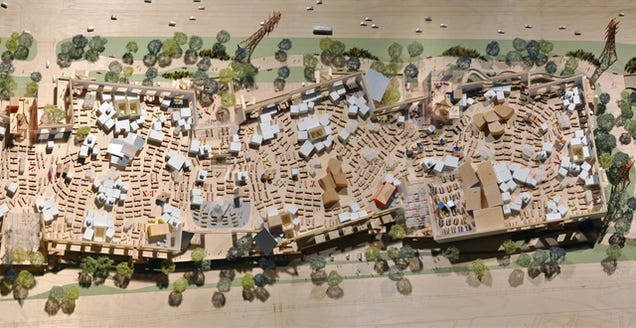
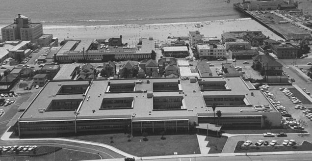
Facebook’s Menlo Park plan. RAND Corporation’s offices in Santa Monica, image via Utile Design.
Even the name of Facebook’s new office feels like it was plucked from the past: It’s called MPK20.
That’s anonymous and utilitarian way to name a very expensive office, and it’s a lot like Building 20—a legendarily crappy building (also known as the “plywood palace”) at MIT that ended up producing some of the most influential work of the 20th century. Building 20 was built during World War II, and it was supposed to be torn down after it ended. Out of necessity, the school started using it as a catch-all for everyone from Noam Chomsky to early pioneers of electronics until it was demolished in the 1990s.
Since then, Building 20 has become a kind of swan song amongst architects—recreating its mixture of randomness and necessity that seemed to result in such remarkable innovation.

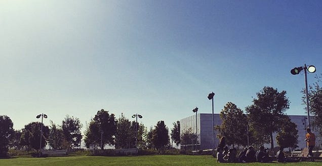
Building 20 at MIT; Facebook’s new building by gk3.
Facebook and Gehry are reappropriating the idea in Menlo Park—but of course, they’re throwing some nice perks in, like art from legendary graffiti artists and a bonkers roof deck. But the bones of the idea are all there.
To do this, we designed the largest open floor plan in the world,” wrote Zuckerberg yesterday, “a single room that fits thousands of people. There are lots of small spaces where people can work together, and it’s easy for people to move around and collaborate with anyone here.”
In the end, each of these offices is the unique product of the company paying for it. But it’s fascinating to see how threads of each plan reach all the way back to the 1950s and 60s. There’s something kind of poetic about the fact that the first wave of buildings were built to house engineers and scientists whose work directly contributed to the creation of cellphones, computers, and the internet itself.
Now, their work—and the offices that housed it—is being put to use by a new generation of engineers and architects. Will Facebook, Apple, and Google have the same impact that IBM or Bell Labs did? Only time will tell.
Contact the author at kelsey@Gizmodo.com.
from ffffff http://gizmodo.com/the-forgotten-offices-that-inspired-apple-facebook-an-1694978864
via IFTTT


0 comentarios:
Publicar un comentario